
Paul Hansen of Sweden, photographer for the Swedish daily Dagens Nyheter
The question of subjectivity in photography, the supposedly ‘objective’ medium, arose again this week. Is this a conundrum peculiar to digital imaging?
The case in point is Paul Hansen, Sweden, photographer for Dagens Nyheter who won 2013 ‘Press Photo of the Year’ for his emotionally powerful 20 November 2012 image of mourning uncles carrying the corpses of two-year-old Suhaib Hijazi and her three-year-old brother Muhammad killed when an Israeli missile strike destroyed their house.

Paul Hansen (2012) Gaza Funeral as it appears on the World Press Photo website http://www.worldpressphoto.org
(AP Photo/Paul Hansen, Dagens Nyheter)
I first encountered this picture that prompted this post in The Age February 15, 2013, under the headline “Mideast funeral picture wins top award. Swedish photographer Paul Hansen has won the 2012 World Press Photo award for a picture of two Palestinian children killed in an Israeli missile strike being carried to their funeral.”
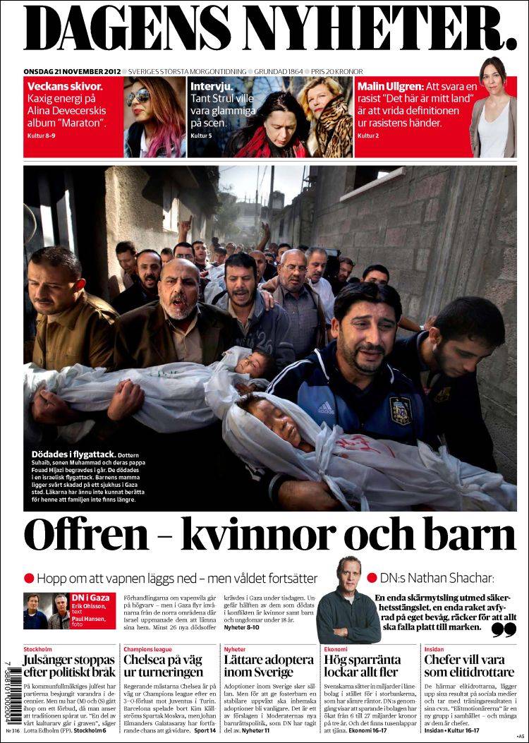
Cropped photograph, version as it appeared in Dagens Nyheter, 21 November 2012
The article continued…
The strength of the picture lies in the way it contrasts the anger and sorrow of the adults with the innocence of the children,” said jury member Mayu Mohanna of Peru. “It’s a picture I will not forget.”
Neither could I. It surely is as powerful and emotionally affecting for anyone with young children.
Hansen attends the funeral. He is walking directly in front, photographing with a wide-angle the brothers, uncles of the children, who are carrying their wrapped bodies. At least one other photographer, Mohammed Saber, is shooting simultaneously on his right. As Der Speigel says: “ His [Saber’s] photo must have been taken in almost the same location and at almost the same time, but it is an ordinary-looking news photo […] it also lacks the resonance and sympathy of Hansen’s image.” It is Hansen whose picture carries off the World Press Photo award.

MOHAMMED SABER, Gaza burial
What makes Hansen’s photograph so effective is that it positions the childrens’ corpses to be apparently offered up to the viewer by one of the uncles who eyeballs the camera, and yells or cries. You recognise that you have seen this before; Michaelangelo’s Pieta being one example…

Michelangelo Buonarroti: The Pietà (1498–1499), St. Peter’s Basilica, Vatican City

Ford Madox Brown (1854, unfinished) ‘Take your Son, Sir.’ oil and pencil on canvas. 38.1 cm × 70.5 cm.Tate Gallery, London
…and Ford Madox Brown’s Take your Son, Sir, another. Both deal in accusation or imply complicity on the part of the viewer and they both proffer the most powerful of evidence; a child’s body.
Hansen has come under attack. Articles such as one with the provocative headline “How the 2013 World Press Photo of the Year Was Faked with Photoshop”, accuse him of faking the image, of combining two or more images. For a photojournalist who has been Sweden’s photographer of the year seven times, this has career-destroying implications.
His accuser is Neal Krawetz, who describes himself as “a computer security researcher with a Ph.D. in Computer Science from Texas A&M University (1998)”, whose interest in the image was aroused by a May 08, 2013 article in Der Speigel. which asks “But where are the limits of cosmetic improvement?” in news photography, pointing out that Hansen’s image looks like
a still from a movie” [Der Speigel].
And who is Krawetz?
[An] example of image forgery appeared in a video of Osama bin Laden issued on Friday, September 7, 2007 before the sixth anniversary of 9/11. According to Neal Krawetz of Hactor [sic] Factor, an expert on digital image forensics, this video contained many visual and audio splices, and all of the modifications were of a very low quality.”
(Shih, F.Y. & Yuan, Y. (2012) ‘A Comparison Study on Copy-Cover Image Forgery Detection in Shih, F.Y. (ed.) Multimedia Security: Watermarking, Steganography, and Forensics. Florida: CRC Press. p.298).
So Krawetz’ used his computer science skills to analyse Hansen’s the image using a program he wrote and used on the bin Laden footage. Krawetz accesses the quantization tables in a JPEG file (also referred to as quantization matrices) to reveal how the image was compressed and by what software and when. Re-saving an image at a known error rate (90%, for example), then subtracting the re-saved image from the original image generates a ‘heat-map’ showing every pixel that changed and the degree to which it changed. The modified versions will indicate a different error level than the original image. (see http://dfrws.org/2008/proceedings/p21-kornblum.pdf or for a more visual explanation go to http://fotoforensics.com/tutorial-estq.php)
Krawetz’ analysis was taken up by the ExtremeTech to charge that Hansen’s award-winning image was “almost certainly a composite of three different photos.” Krawetz on his blog on Sunday, May 12. 2013 says specifically:
So here’s what likely happened… The photographer took a series of photos. However, the sun’s position made everyone dark and in silhouette. So, he combined a few pictures and altered the people so you could see their faces. Finally, I found other photos of the same people. What stands out to me is that the foreground child in Hansen’s “photo” has much more dirt on his face than the same child in the other photos.”
He does not detail how you can combine ‘a series of photos’ of a moving crowd. ‘Series’ suggests photographs taken one after another over time. In a subsequent post this rash statement is moderated to a degree – Krawetz resiles…he meant several versions of the one photo.
On Monday 14 Extremetech.com wrote: “Basically, Hansen took a series of photos – and then later, realizing that his most dramatically situated photo was too dark and shadowy, decided to splice a bunch of images together and apply a liberal amount of dodging (brightening) to the shadowy regions.”
Unfortunately the idea that the image is a montage was taken up by the likes of David Horowitz’ neoconservative online journal FrontPageMag.com, (aka Front Page Magazine), which on May 14 declared Hansen’s image a “Pro-Hamas Propaganda Photo” and a “Fraud”, asserting that:
Hansen didn’t have the budget to get enough of the locals in the same place at the same time to get the “packed corpse mass” he was going for, so he had to do some compositing and then once he did that, he began playing around with the lighting to make his very own Photoshop Guernica.”
There is part of all this that is undeniable. …Hansen admits: “I developed the raw file with different density to use the natural light instead of dodging and burning. In effect to recreate what the eye sees and get a larger dynamic range”. Digital High Dynamic Range, especially HDR generated from copies of the one exposure, can look awful, and almost invariably does. There is a degree of unreality about the tonality of Hansen’s picture. But take the time to look at the rest of the field in the Press Photo of the Year Award and you will see this is endemic; most look theatrical, even melodramatic. It is de riguer to ‘enhance’ one’s image to make it look ‘aesthetic’. Is it just because we can, even on our phone camera, and being able to do it, have we grown to accept the manipulations of Instagram as being artistically valid?
But what if you look at the photo and visualise the actual situation? The bounce-light into the alley from the sunlit wall is intense because the space is very narrow and surrounded by high walls. What would W. Eugene Smith make of it? See in his Spanish Village essay for LIFE other shots in narrow lanes lit indirectly and directly by the sun:

W. Eugene Smith “Extremadura. Province of Caceres. Deleitosa. 1951. Women mourning at Juan Carra Trujillo’s funeral”. From “Spanish Village” photo-essay.
With the correct exposure and contrast Hansen’s alleyway presents the classic broad-source light along with strong backlight that we might find in a photographer’s studio. Hansen is right to say it is ‘magic’. But that is not to admit it is ‘magic’ the sense of ‘manipulated light’ in Krawitz’s very purist ideas about what a manipulated photograph might be, about photography and light, and the position of the sun, that he uses to support his assertion that the image was the result of combining a number of shots. That the sun is above and behind the crowd is merely affirmed by his ‘shadow analysis‘, which does not prove there has been any ‘dirty work’ (at 31° N it’s high in Gaza approaching noon, year-round).
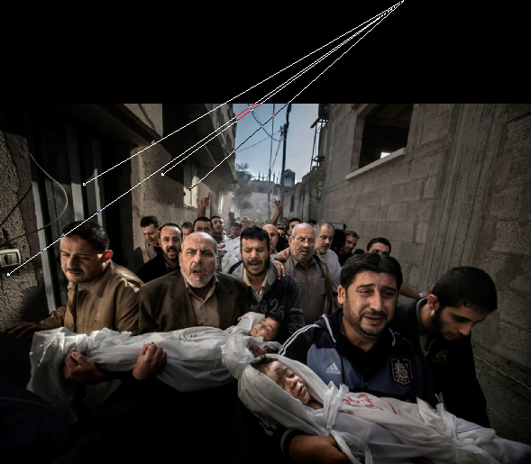
Krawitz’ “Shadow Analysis” from his blog post.
From inexperience as a photographer, he fails to recognise that because the alley wall is interrupted by niches and doorways, that will reflect light back into shadowed faces. His subsequent post modifies these claims but still uses language to imply that more is being altered; “I noted that the crowd differed in quality. Some people were modified more than other people”. Read that in isolation and it would seem to be saying that other people have been stripped in to the image.
Nevertheless, Hansen himself admits to manipulating the tonal values. Is that wrong? Let’s look at some other examples of manipulation before we blame the digital age for this.
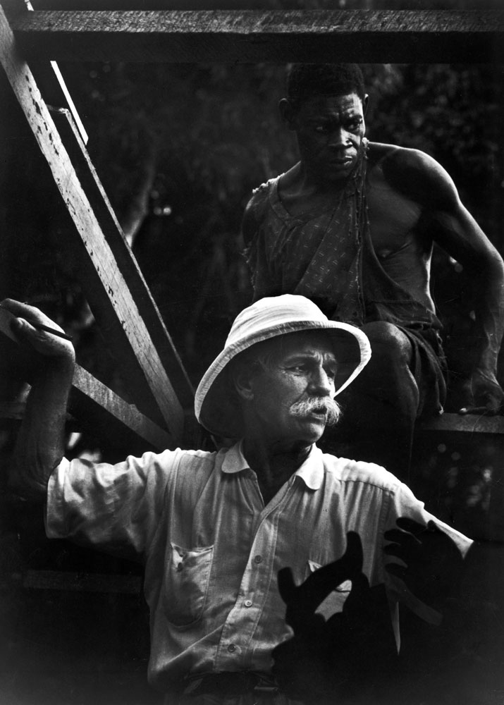
In the Albert Schweitzer series he made for LIFE, W. Eugene Smith also uses a method of achieving a high dynamic range. For the portrait of the great man working through the night, Smith was faced with the problem of the light source, a shaded lamp, being in middle of the photograph. The relative intensity of the light, and its rapid falloff before reaching Schweitzer, produces many stops difference between the two critical elements. Smith who worked for three days to draw detail from both that was present on the negative (no doubt through long exposure and push processing), into his print and across its lower tonal range. In his armoury was the usual darkroom dodging and burning, but on the final print, which was exposed for highlight detail, he employed Farmer’s Reducer, a potassium ferricyanide solution, to slowly bleach back the detail in the blacks and shadows.

W. Eugene Smith,
French Equatorial Africa. Gabon. Lambarene. 1954. “Dr. Albert SCHWEITZER in his office”.
What Smith achieves however is to my eye perfectly believable. So is the image that headlines the Schweitzer article. This actually is a composite; two negatives superimposed in printing. The silhouetted human hand and saw handle in the lower right corner are printed-in. It certainly adds a dynamic, graphic element that enhances the idea of “Albert Schweitzer supervises the building of a hospital in Gabon, West Africa, 1954”.
Albert Schweitzer supervises the building of a hospital in Gabon, West Africa, 1954
This post is titled Subjective/Objective. Somewhere between the two lies truth. The facts are the death of two children and their father; “two-year-old Suhaib Hijazi and her three-year-old brother Muhammad who were killed when their house was destroyed by an Israeli missile strike. Their father, Fouad, was also killed and their mother was put in intensive care. Fouad’s brothers carry his children to the mosque for the burial ceremony as his body is carried behind on a stretcher in Gaza City, Palestinian Territories, Nov. 20, 2012. (AP Photo/Paul Hansen, Dagens Nyheter)”.
Hansen’s photograph, its content, but also the way he took it, tells us that we are all implicated in this drama. I certainly don’t agree with Krawitz that “As death photos go, [this is] pretty tame”. Since he willingly admits ignorance of photography history, (“Who are Sebastião Salgado and Gene Smith”, he says in response to arguments like the discussion above about Smith) we can really only depend on his contribution of compression data analysis. As for his self-vindication for tarnishing the reputation of a recognised photojournalist and writing brash language that is likely to fan the flames of Zionist/Hamas tensions, as has been a consequence in this case, I will leave to Krawitz’ conscience.
On Tuesday evening 14 May the World Press Foundation announced results of an independent forensic analysis of the image:
It is clear that the published photo was retouched with respect to both global and local color and tone. Beyond this, however, we find no evidence of significant photo manipulation or compositing,” said computer science professor Hany Farid of Dartmouth College who studied the image with his co-founder of Fourandsix Technologies, Kevin Connor. “Furthermore,” they said, “[Krawetz’] analysis purporting photo manipulation is deeply flawed.”
The other digital photography expert commissioned by WPF, Eduard de Kam of the Netherlands, said that there had “been a fair amount of post-production” on the image, but all of the pixels were “exactly in the same place” in the RAW file as they were in the JPEG submitted to the contest.
That is, they conclude there is none of the montaging that Krawitz’ language still seems to imply. Where Krawitz and Der Speigel are right, however is the degree of HDR enhancement that can be legitimately applied before it gets ugly. However, with his words; “Journalists are supposed to capture the unaltered event. Staged photos, significant edits, and fictionalized events are typically unacceptable in professional journalism photography”, Krawitz implies an accusation too far by associating them with Hansen’s image.
If printed as is the version in his newspaper, or as presented on the World Press Photo site (both on this page), or even if it were in B&W, Hansen’s image remains a subjective indictment of our impassivity in face of the objective fact of unconscionable violence against innocents.
Related articles
- World Press Photo of the Year was not a fake (theweek.co.uk)
- ‘Faked with photoshop’: picture furore (smh.com.au)
- World Press Photo winner cleared after ‘forensic examination’ (independent.co.uk)
- Don’t call it a fake: World Press Photo confirms 2012 Photo of the Year is real (digitaltrends.com)
- Award-winning photo isn’t a fake, say specialists (news.cnet.com)
- Press photo group stands by winning shot of Gaza funeral (jta.org)
- World Press Photo stands by winning shot of Gaza funeral (timesofisrael.com)
- How the 2013 World Press Photo of the Year was faked with Photoshop (extremetech.com)

Pingback: On This Date in Photography·
Pingback: November 9: Concern – On This Date in Photography·